


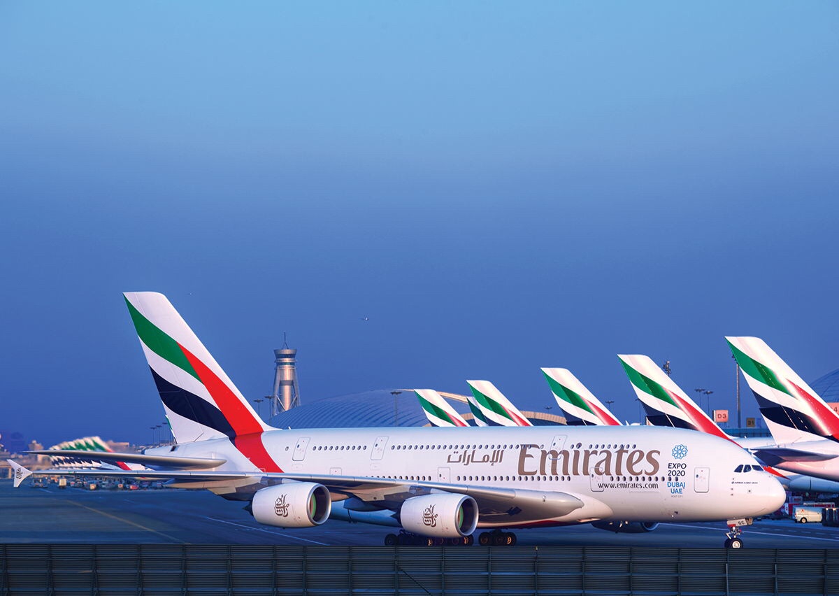
In the world of commercial aviation, Emirates and Singapore Airlines are two leaders and competitors known for their world class in-flight experience, at par with modern industry standards and passenger tastes. Award-winning in-flight entertainment, multi-lingual cabin crew, an ever-expanding route network, gourmet cuisine and a company sponsored Ab-initio pilot training program are some of the many features which characterize the aforementioned airlines. All of which, without a shadow of a doubt make life better for their customers and employees. It is worth noting that these two airlines have done very little – in comparison to Pakistan’s state-owned airline, PIA – to revise their aircraft liveries over the past three decades.

Another big name- The Singapore Airlines’ logo is a bird. The logo is featured on the tail fin and in the airline’s collaterals and has remained unchanged since Singapore Airlines’ inception from the split of Malaysia–Singapore Airlines. The logotype and stripes underwent a minor tweak in 1987, 31 years ago. The livery only had a recent change, which saw the “Singapore Airlines” logotype enlarged and moved towards the front and the “bird” logo on the tail fin enlarged, in a similar fashion to the livery variant used on the Airbus A380. Nevertheless, the stripes and the “bird” remained the same.
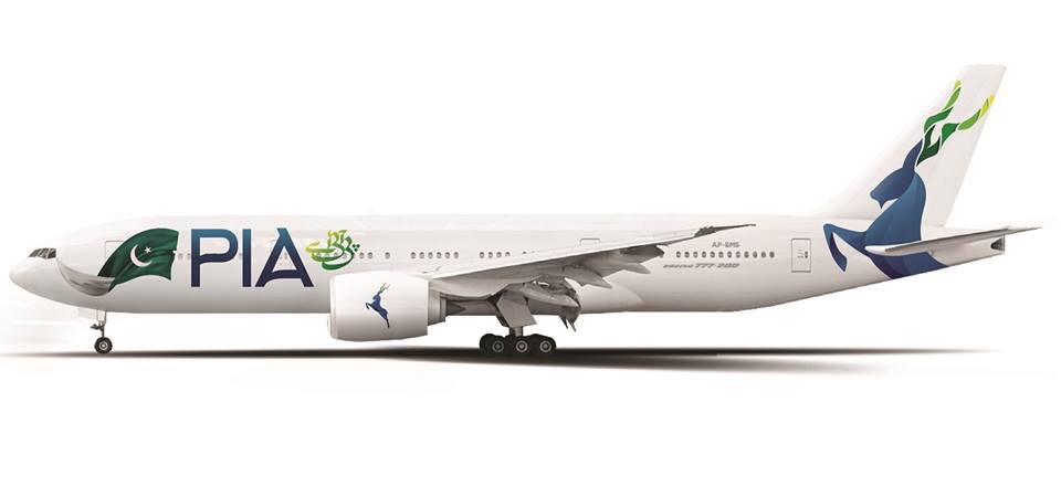
From 1985 to 2018, PIA customers, employees and aviation enthusiasts have seen the airline change its livery, for a staggering 7 times which includes, the short-lived Pashmina and the provincial tail designs. Towards the end of 2017, the airline with the induction of a wet-leased Boeing 777-300ER, adopted the euro white livery, eradicating the green and golden line, which ran diagonally on both sides of the fuselage and met close to the horizontal stabilizer of the aircraft. It was recently that the proactive social media accounts of PIA opened a livery competition in an effort the re-brand the company – yet again. The competition attracted an astoundingly high number of entries, most of them absolutely horrendous, which were evidently designed by amateurs and lacked the very basic sense of placement and aesthetics, which happen to be two imperative qualities for designing anything.
If media reports are to be believed a whopping 3 billion rupees will be spent on implementing the design on all aircraft, which was ultimately selected by the concerned departments. The 3 billion rupee estimated figure, is an alarming red flag for an airline which has continually delayed its employees rightful salary payouts in recent months, an airline which severely struggles to provide blankets or cushions to its passengers on long-haul flights and still relies on a decade old and unreliable in-flight entertainment system to keep itself attractive towards revenue passengers.
All successful airline managements have an appreciation of the fact that passengers are seated inside an aircraft, and that is where the money should be invested in order to genuinely satisfy a fare-paying passenger. Repeatedly revising liveries is a blatantly pointless branding stunt, which is more of a smoke screen to keep people’s attention diverted away from key issues facing the airline for years. Moreover to sooth the egos of executives who are under the illusion that their branding experiments are a solution to the short-term and long-standing challenges faced by the airline.